


27.02.2026
93


According to statistics, more than 54% of the world’s internet traffic comes from mobile devices, so online business owners are forced to pay more attention to how their web application will be displayed on a client’s smartphone. It is important to understand that if your goal is to increase sales, you must make sure that your website is responsive on mobile devices.
If you are thinking about implementing a 3D configurator, this article will help you learn about the main features of developing 3D web applications for mobile devices.

Responsiveness is the ability to “adjust” the screen size of the user’s device. A responsive site will maintain the quality of the layout and display content, no matter what device you are viewing it from: be it a PC, smartphone, or tablet screen.
A responsive layout is a way of designing web pages in which they will dynamically adjust to the size and orientation of the device screen. Moreover, the design of the page and its structure may differ significantly on different screens. Implementing a responsive layout will ensure that the site remains user-friendly and provides conversions when loading on different devices.

Mobile devices are no longer being used for just phone calls or messages, they are now used for a multitude of reasons, especially purchasing goods and services. More often than not, purchases are made “here and now” – right after a person has had an idea to buy a certain product or service.
The main advantages of websites that have a responsive mobile design:

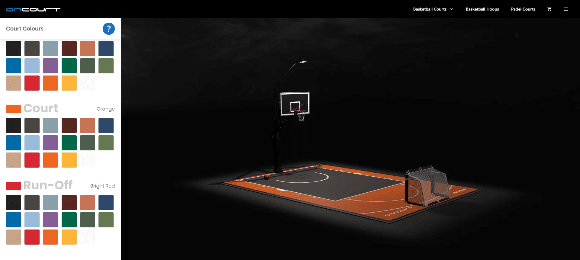
As you can imagine, the main problem for developing a responsive interface for mobile devices is the limited screen space. The main goal is to develop an interface that displays all of the main blocks that websites feature within a smartphone screen.
The main blocks of the configurator interface usually include:
A user will use their finger to use your website or app, so it is important to avoid an interface that is too small so that the elements achieve the best usability and function.
There are also 2 types of screen orientation:
When developing certain types of interfaces, preference is given to the Landscape mode, but you may want to bear in mind that with this orientation, most of the screen will be occupying the header of the user’s web browser.
In addition, it is important to develop specific logic that will determine the screen orientation of the user’s device in real-time and, if necessary, display an informational Popup that will ask the user to turn his device over. In addition, some users may be uncomfortable with this view mode. Therefore, to maintain user loyalty, we advise you to make sure that your web application is available in Portrait and Landscape modes.
The fact that iOS is a closed operating system makes it more demanding for web applications. This is especially true for 3D scenes.
The main limitations to take into account when developing a 3D scene that is iOS device friendly are:
3D scenes that are not optimized may simply not open on an iPhone, unlike iPad or Android devices. Therefore, to make your configurator friendly for all mobile devices, it is important to pay attention to the optimization of the 3D scene.

Since AR-enabled web applications are gaining popularity, it is now easy for users to “try on” furniture in their home before committing to purchase it. With the development of this function for 3D configurators, in some cases, it proves difficult to use. This is due to the closed nature of the iOS operating system, and the strict rules for interactive web applications. Android devices are able to function in high capacity for AR-enabled web applications.
iOS lags far behind modern WebXR standards, which complicates cross-platform AR applications and makes them more expensive. At the moment, you can implement cross-platform in three ways:
If you are thinking “do I need to develop my configurator for mobile devices?” The answer is Yes! The benefits of implementing a responsive mobile version of your configurator range from increasing sales, reducing overhead business costs and enhancing business efficiencies. Take a look around your friends, family, maybe even yourself, and notice how often you make purchases or search for different goods right from your smartphone.
If you are interested in developing a high-quality 3D configurator that will be friendly for all modern mobile devices, please feel free to leave your contact details in the feedback form. We will then contact you to discuss your business objectives and needs!

